
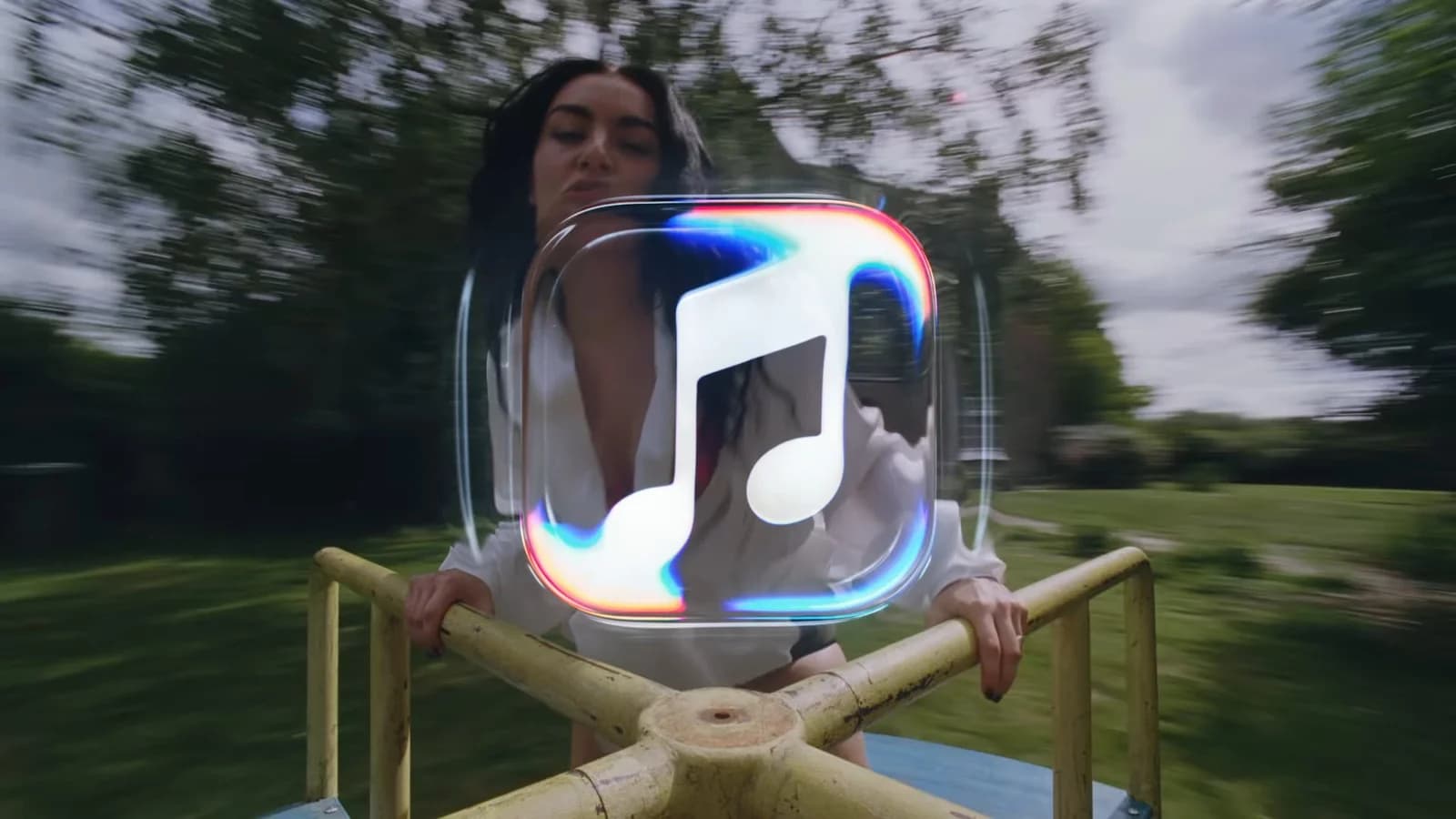
Apple Music has unveiled a new brand identity built around the idea “made by sound”, with a redesigned logo and an accompanying audio signature. Announced on 21st October 2026, the refresh uses an original composition by British producer Fred again.. and collaborator NEST Acoustics as the starting point for its visuals.
For listeners, the most obvious change is the move away from the familiar red app icon. A black-and-white replacement is already in iOS 27.2 testing, alongside changes to colours inside the Music app. The announcement explains the creative process behind the new look, with the branding also due to appear across Apple Music’s original content and event programming this week.
Apple’s behind-the-scenes film introduces the collaboration and describes the imagery as “captured entirely in camera”. The physical behaviour of liquid under vibration supplied the material for the design.
The team played individual musical notes through a transducer, a device that turns an audio signal into physical vibration. In the setup described for the project, those vibrations moved a shallow bath of mineral oil. A camera recorded the ripples and the way light bent through the moving liquid.
Those filmed movements informed the new visual identity, including a revised musical note. The composition also became a sonic signature: a short piece of audio intended to identify Apple Music in the same way that a logo identifies it visually. The moving imagery and the audio therefore come from the same creative process.
The lettering has changed too. The new wordmark, the written part of the logo, pairs the Apple symbol with heavy lowercase letters in a customised version of SF Pro, Apple’s own typeface. It retains the Apple Music name while giving the word “music” a different shape and weight.
The liquid effects also fit Apple’s Liquid Glass design, the translucent interface style introduced across its software in 2025. That connection is easiest to see in the moving promotional imagery, where reflections and distortion are part of the presentation.
The new app icon appeared in the fourth iOS 27.2 beta on 13th October. In light mode, it has a black musical note on a white background; dark mode reverses those colours. Selected navigation icons and text in Music’s settings also changed from red to blue, while widgets gained black backgrounds.
The wordmark had already appeared in marketing for Apple Music Hall, the live music venue Apple announced in London last month. Today’s reveal brings those earlier sightings together under one identity.
The refreshed branding is expected to reach iPhone users with iOS 27.2. Earlier today, we explained the app changes coming in that update; its public release is expected before the end of October, with a specific date still unconfirmed.
Apple’s rebrand announcement does not promise better recommendations or an improvement in audio quality. Its immediate effect is on how Apple Music looks and identifies itself. The filmed liquid gives the promotional work a connection to music that a static icon cannot fully convey; on a Home Screen, the practical change remains a new symbol and a different set of colours.



Comments
No comments yet. Be the first to share your thoughts.